CNP Expo & CardNotPresent.com
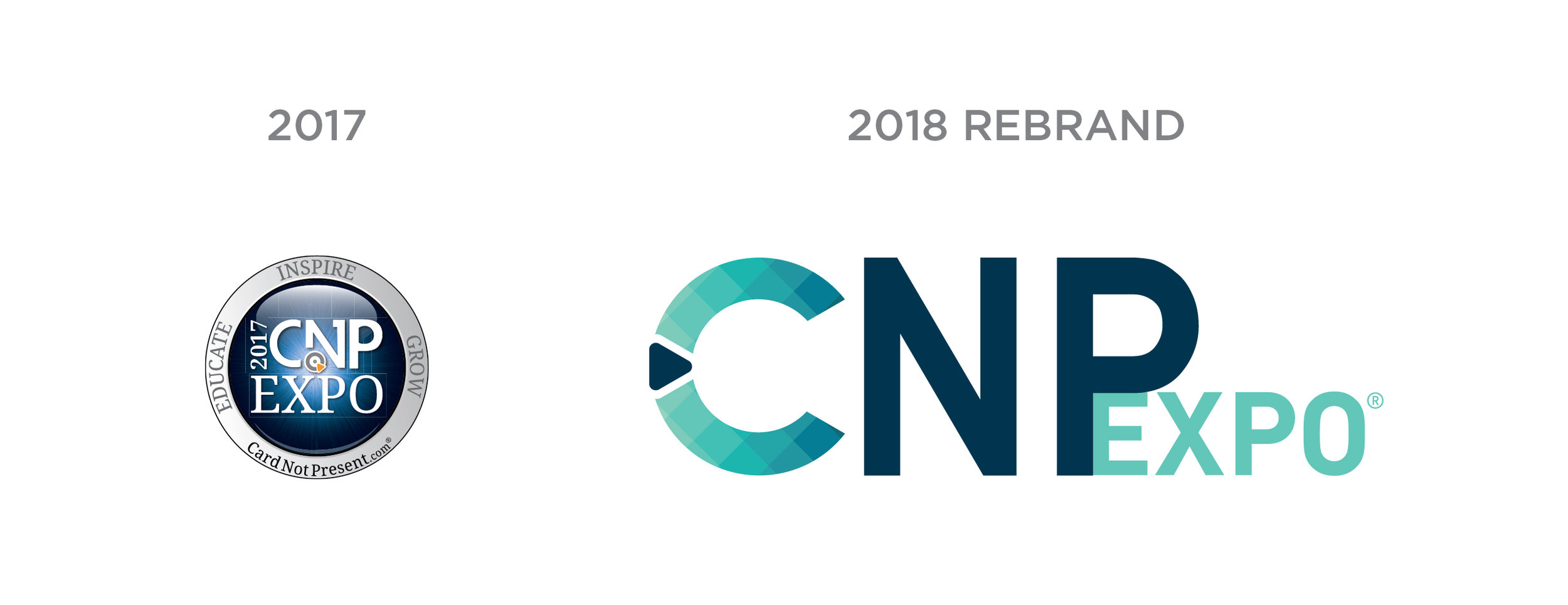
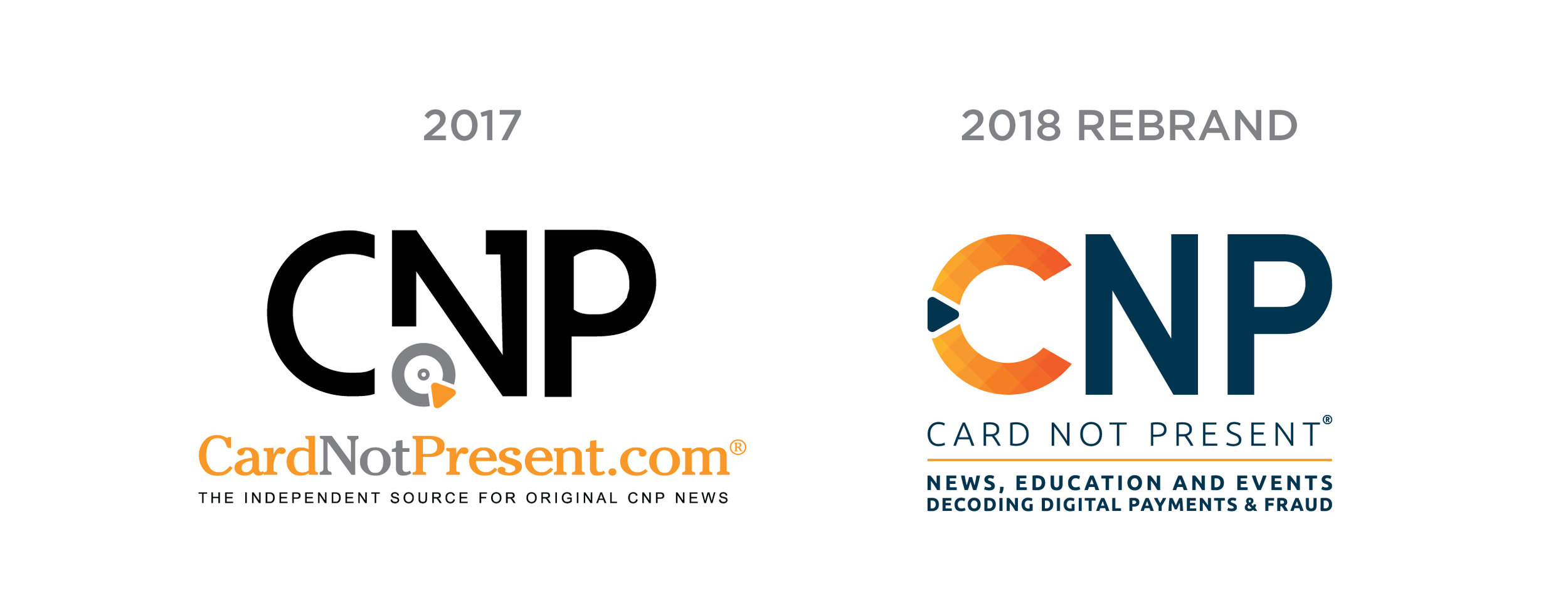
In September 2017, my team and I were tasked to redesign the CNP Expo and CardNotPresent.com brands for the upcoming 2018 show year. The web based platform and the corresponding tradeshow had little to no consistencies between their branding, they needed a full rebrand starting from the logo, to the ads, creative, color palettes, branding perspective, online appearance, etc.
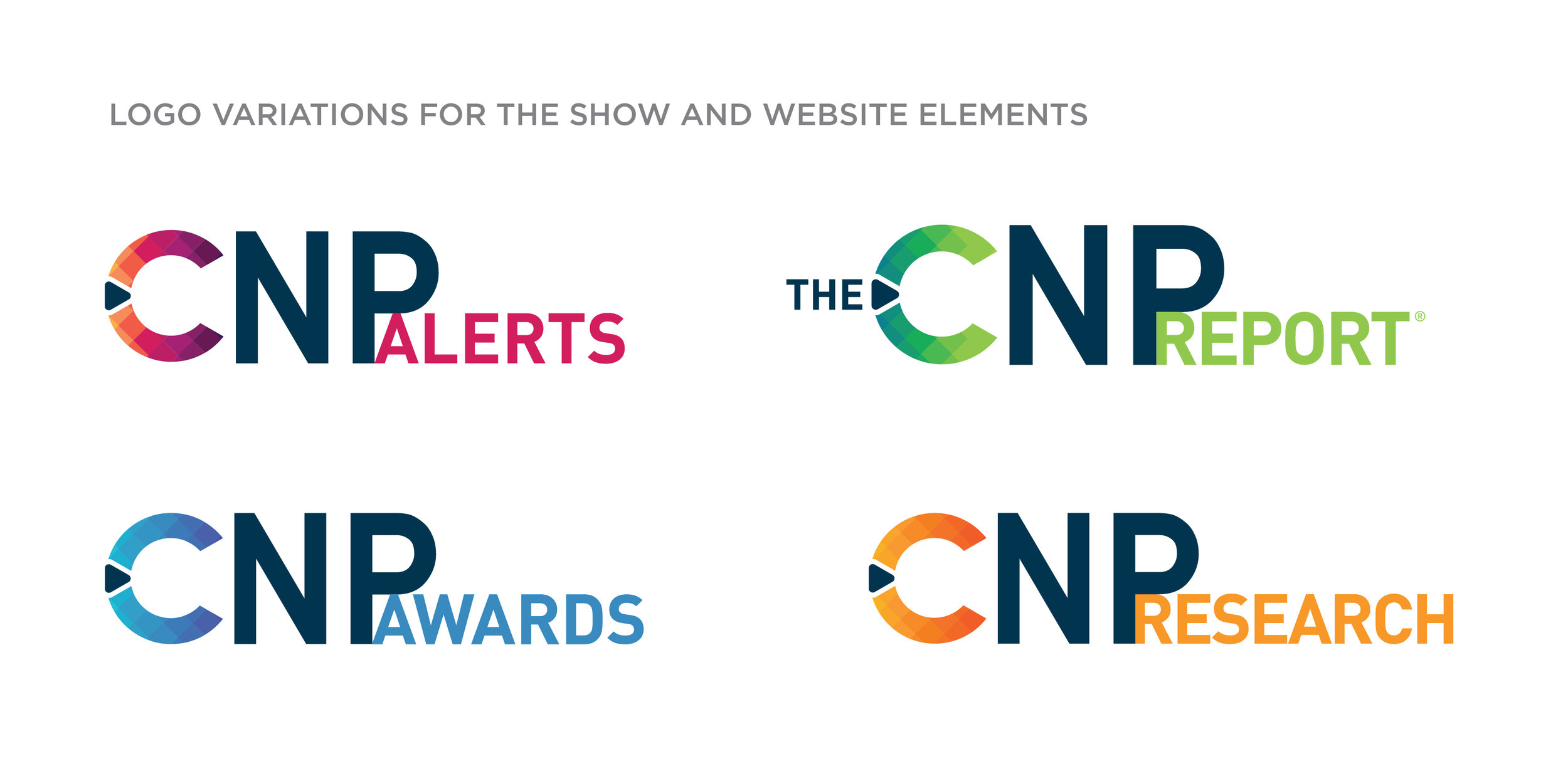
Starting with the logo, we knew we wanted something modern and clean. There are a lot of elements to this brand and they needed a way to tie everything together. The final logo was a team collaboration with brainstorming, sketches and finally a look we loved. The color gradient and pattern provided a new element that could easily be tied into other elements and color palettes. From there, we developed a way to incorporate other sections of the show and digital segments by playing with color while keeping the core CNP text treatment.
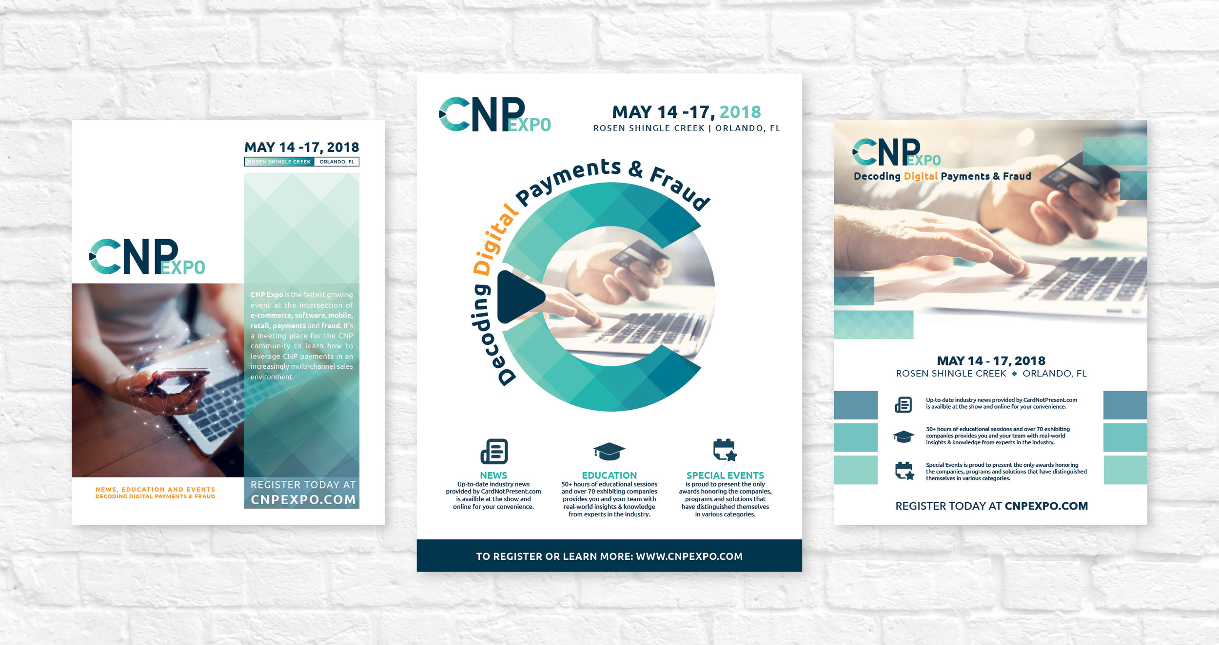
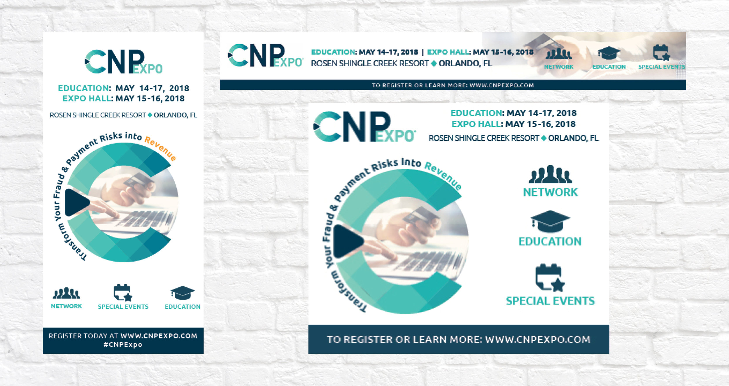
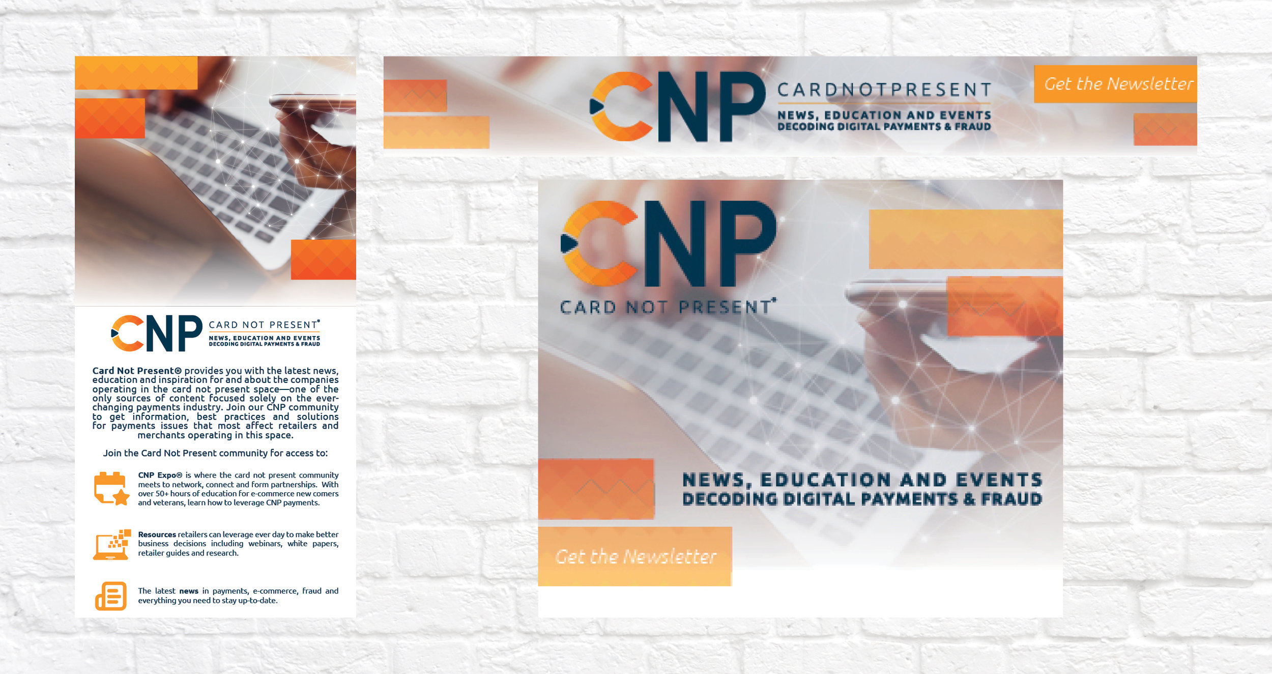
After the logo and the color patterns were finalized, the team took to creating the new creative ads. *I did not design the creative ads but I did provide the art direction to my team through teamwork and rounds of review. The ads were then reflected into the website designs and we really saw our creative come to life, a full 360. Our branding was strong and consistent to easily fit in whatever digital, print and interactive element we needed.
With the entire team effort, we won the End of the Year Reed Exhibitions Collaborative Creative Piece of the Year. Our teamwork and efficiency was highly recognized and praised within our company.